

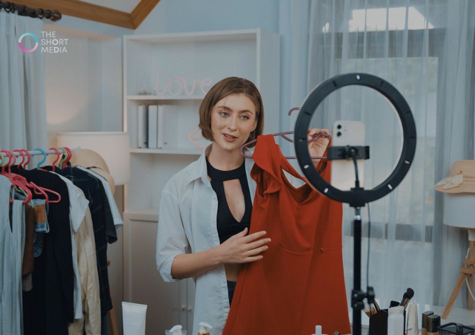
I’ve seen this happen more than once: a brand finally gets a TikTok video to move. Clicks are cheap, comments are flying, someone on the team starts refreshing Shopify every six minutes… and then the landing page quietly kills the whole thing.
Not because the product was bad. Usually the problem is simpler. The page felt like it belonged to a different internet.
TikTok traffic behaves differently from search traffic, email traffic, even Meta traffic half the time. People arrive fast, a little skeptical, and usually mid-scroll-brain. If you’re running TikTok paid ads, your product page has to keep the same energy as the ad without turning into chaos. That’s where a lot of brands miss.
A high-converting TikTok landing page isn’t just “optimized.” It feels like the click made sense.
Why TikTok traffic bounces from otherwise decent pages
A product page can look polished and still underperform badly with TikTok visitors.
I’ve watched beauty brands send traffic from a casual creator-style demo into a page that opened with stiff studio photography and a headline that sounded like it came from a packaging brief. Immediate disconnect. Same product, same offer, but the landing page made the whole thing feel less believable.
This is one reason a good TikTok Ads Management Service usually spends time on post-click experience, not just creative and media buying. The ad gets attention. The page has to cash it in.
With TikTok advertising services, the strongest results usually come when the landing page answers the exact little questions people had while watching the video. Not the questions your internal team thinks they have. The real ones.
Like:
– Will this actually fit under my sink?
– Is this foundation going to separate on textured skin?
– How big is this protein shaker, really?
– Does this work if I rent and can’t drill into tile?
That stuff matters more than another paragraph about “premium quality.”
The page should feel like the ad’s next sentence
That’s the easiest way I know to explain it.
If your ad shows a mom in Arizona using a stain remover on a juice spill in her kitchen, don’t send people to a product page that opens with a floating bottle on a white background and three vague claims. Keep the thread going. Show the spill. Show the countertop. Show the result. Let people feel they landed in the right place.
This is especially important with TikTok paid ads, because the click often comes from momentum, not deep intent. People aren’t always arriving ready to read. They need fast confirmation.
Message match is boring to talk about and expensive to ignore
The headline doesn’t need to be clever. It needs to match what got the click.
If the ad is about “curling your hair in 10 minutes before work,” your page should not lead with a brand manifesto. If the ad is about “meal prep that doesn’t taste like cardboard,” don’t start with the founder story.
Founder stories can help later. Just not in the first screen.
Teams offering TikTok advertising services often find this out the hard way when the CTR looks great but conversion rate stays flat. The ad did its job. The page started talking about something else.
Above the fold: less brand theater, more proof
For TikTok traffic, the top of the page needs to work quickly.
That usually means:
– a clear product name
– a benefit people can understand in two seconds
– pricing or offer visibility
– social proof that doesn’t feel fake
– an obvious add-to-cart or buy-now path
– a visual that looks usable, not overproduced
I’d take a slightly scrappy demo GIF over a glossy hero image if the demo actually explains the product. A kitchen-shot clip of a food chopper saving 15 minutes on dinner prep can outperform expensive studio content. I’ve seen it. Same with home products. Someone organizing a messy linen closet on an iPhone often beats the pristine lifestyle banner.
A solid TikTok Ads Management Service will usually push for those practical changes, because pretty pages don’t always convert from short-form traffic.
Don’t hide the product demo halfway down
This one is constant.
If the ad got the click because it showed the product in action, the page should repeat that proof near the top. Not after five blocks of copy, two UGC quotes, and an ingredient carousel.
For beauty, put texture, finish, and wear results up front. For fitness products, show setup and actual use. For home gadgets, show before/after and scale. For local services in the USA, if you’re using TikTok to generate leads for something like med spas or home cleaning, the page needs clear booking steps, service area info, and a real human face fast.
Comments are market research. Use them.
One of the most useful habits in TikTok advertising services is reading ad comments before revising the landing page.
Comments tell you what people still don’t understand. Or don’t trust.
I’ve seen comments on a supplement ad asking whether the packets are chalky, while the sales page spent 400 words on ingredients and said nothing about taste. I’ve seen a home organization product get hit with “does this damage walls?” over and over, while the product page buried the no-drill install detail in a tab.
That’s fixable. Add the answer where people can see it. Better yet, use the exact phrasing customers use.
A smart TikTok Ads Management Service doesn’t treat comments like noise. They’re often better than a formal survey.
Social proof has to look earned
TikTok visitors can smell fake reviews pretty quickly. Maybe not always consciously, but they feel it.
If every testimonial sounds polished and oddly complete, trust drops. Same if your reviews all say basically the same thing. Real proof is messier. A little more specific.
Good examples:
– “Used this on my 7-year-old’s white baseball pants and, weirdly, it worked better after sitting 10 minutes.”
– “I bought this for my apartment bathroom and thought it would look cheap. It doesn’t.”
– “Shade 4 was better for me than I expected. I usually oxidize everything.”
That kind of detail helps. So do review photos that aren’t perfect.
This is where TikTok paid ads and on-page proof need to support each other. If the ad uses creator content, the landing page should continue that human tone instead of switching into catalog mode.
Mobile speed matters, but so does mobile patience
Everyone says site speed matters. Sure. But what actually hurts TikTok landing pages isn’t only load time. It’s friction.
Tiny variant selectors. Popups that hit before the page settles. Discount wheels covering the add-to-cart button. Long accordion sections that hide the one shipping detail people care about.
If you’re selling an Amazon product through DTC landing pages, or launching into Target, Ulta, or Walmart while still running direct-response traffic, make the path obvious. Buy here. Find in store. Bundle option. Delivery timing. Don’t make people decode it.
A lot of TikTok advertising services focus heavily on front-end creative, but the page experience is usually where cheap clicks turn expensive.
Your copy should sound like a person, not packaging
This is a sneaky one.
Many product pages fail because the copy gets too formal right when the customer wants reassurance. TikTok traffic tends to respond better when the page sounds plainspoken and specific.
Instead of:
“Engineered for superior hydration and lasting dermal support”
Try:
“Feels light, layers well under makeup, and doesn’t leave that sticky film some serums do.”
That’s the kind of line that actually helps someone buy.
The same goes for scripts in creator content. When a creator reads a brief too perfectly, performance usually slips. The landing page can make the same mistake. A strong TikTok Ads Management Service will often rewrite on-page copy to sound closer to how people really talk about the product.
What good TikTok landing pages usually include
Not every page needs every element, but the better-performing ones tend to have a few things in common:
Fast proof near the top
A demo, a result, a clear use case. Something beyond branding.
Objection handling in plain English
Shipping time, sizing, shade help, installation, returns, compatibility. Put it where people can find it without digging.
Visual continuity from the ad
Same offer, same tone, same use case. Don’t make the click feel like a bait-and-switch.
Purchase paths that are obvious
Especially on mobile. Sticky add-to-cart can help. So can simple bundle choices.
Realistic UGC or reviews
Not over-edited. Not too clean. A product demo filmed in a real kitchen can do more than a polished lifestyle block ever will.
This is why brands often pair TikTok paid ads with a dedicated landing page instead of sending traffic to a generic PDP. And it’s why TikTok advertising services worth paying for usually care about CRO too, even if they don’t call it that.
FAQs
1. Do I need a separate landing page for TikTok traffic?
Not always, but often it helps. If your regular product page was built for branded search or repeat customers, it may be too slow, too polished, or too broad for short-form traffic.
2. How long should the page be?
Long enough to answer objections, short enough to keep momentum. For a $24 beauty item, you probably don’t need a mini novel. For a $180 home device, people usually need more proof and more detail.
3. Should I use the same video from the ad on the landing page?
Usually, yes. Or at least a cut from the same shoot or creator batch. The continuity helps, and it reassures people they landed where they meant to.
4. What matters more: copy or design?
If I had to pick, I’d say clarity. A beautiful page with vague copy underperforms all the time. An average-looking page with strong demos, useful copy, and obvious buttons can do very well.
5. Are reviews really that important for TikTok traffic?
Very. Especially for products people haven’t heard of before. But they need to feel believable, not like they were cleaned up by legal and brand teams for three weeks.
6. What’s the biggest mistake brands make?
Sending TikTok traffic to a page that feels like it was made for everyone. That usually means generic headlines, no clear demo, and too much brand language too early.
7. Do TikTok landing pages need discounts to convert?
Not necessarily. A discount can help, but weak pages often use offers to cover up unclear messaging. If people don’t understand the product, 10% off won’t save much.
8. Can a TikTok Ads Management Service help with landing pages too?
The better ones usually do, even if lightly. A strong TikTok Ads Management Service should at least flag message mismatch, missing objections, weak mobile UX, and places where the page breaks the flow from the ad.
A high-converting TikTok page isn’t about copying trends onto your website. It’s about keeping the promise of the click. That sounds simple. In practice, it’s where a lot of revenue gets lost.